
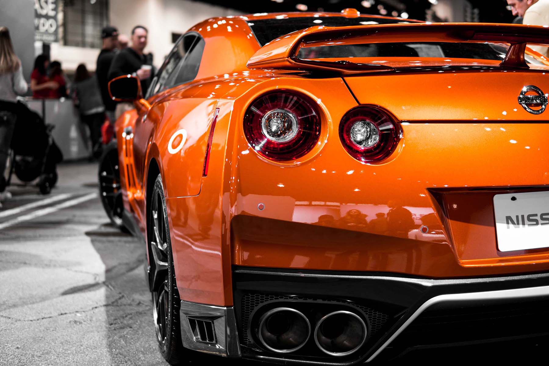
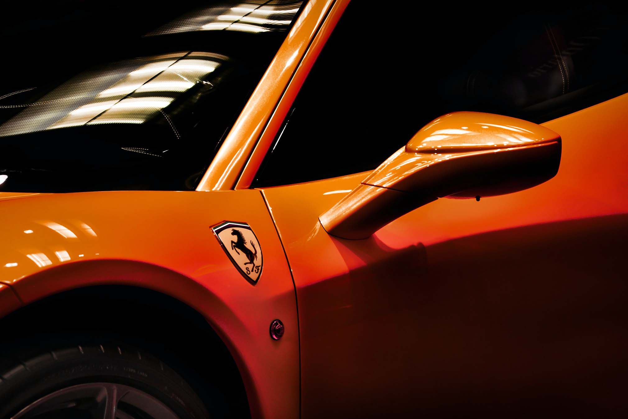

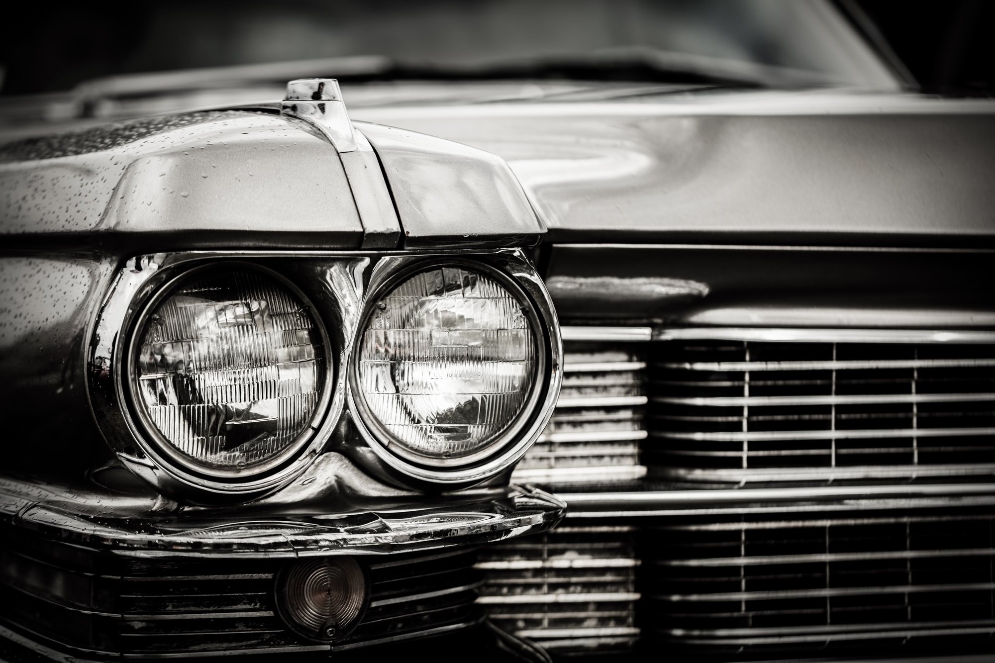
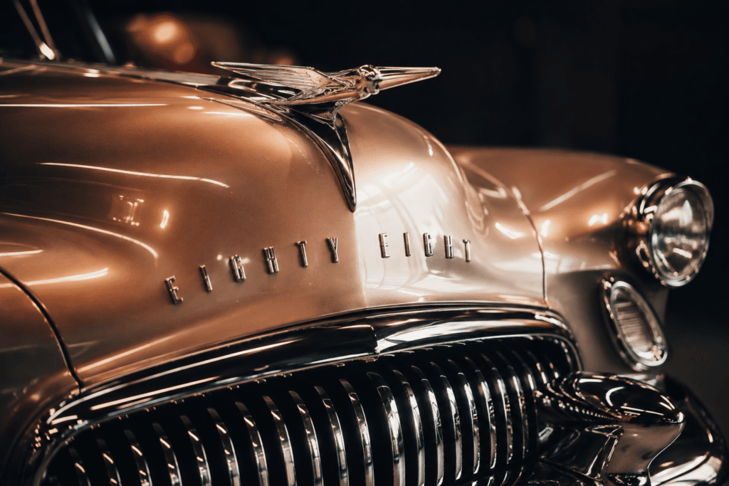
When people look at a beautiful automobile, they often notice the body lines, wheels, paint color, and overall shape first. Yet some of the smallest details can have an equally powerful effect. A badge on the hood, a model name across the trunk, or a carefully designed emblem on a grille can give a vehicle its identity. These details are part of automotive typography, an often-overlooked area where graphic design, branding, engineering, and automotive art come together.
Automotive typography is more than simply putting words on a vehicle. The shape of letters, spacing between characters, materials, placement, and overall composition can communicate an automobile’s personality. A formal script can suggest luxury, while bold block lettering can communicate performance or strength. Even a simple number on a racing car can become an instantly recognizable visual symbol.
For automotive artists and enthusiasts, studying these details provides another way to appreciate the design of classic and modern vehicles. Typography can turn a recognizable car into a memorable piece of visual culture.
Why Automotive Lettering Matters
 Automobile manufacturers have used badges and nameplates as important elements of vehicle identity for generations. The Henry Ford’s collection notes that early automobile badges were often relatively small and discreet, while later designs became larger and more prominent. The museum also explains that automobile badges became important expressions of manufacturer identity and recognition. Explore the American Motors emblem collection at The Henry Ford.
This evolution shows why typography deserves attention when studying automotive design. A vehicle’s name can communicate a specific image before the viewer knows anything about its mechanical specifications. The lettering itself becomes part of the experience.
Consider the difference between an elegant script nameplate and a wide, geometric badge. Both may identify a vehicle, but they create very different impressions. Designers understand that typography carries emotional meaning, which is why the same basic word can feel completely different depending on how it is presented.
The Relationship Between Lettering and Vehicle Personality
Automotive lettering often reflects the personality of the vehicle. Luxury automobiles may use thin, refined lettering with carefully balanced spacing. Performance cars can use aggressive, angular characters. Utility vehicles may favor simple, durable-looking typography that reinforces their practical image.
Model names can also evoke places, lifestyles, animals, speed, luxury, or adventure. The Henry Ford’s collection notes that automobile model names can contain references to locations, social status, environments, and aspirations. Different lettering styles can reinforce those associations. See the historic Lincoln automobile emblem in The Henry Ford’s collection.
That connection between words and visual design is particularly interesting to automotive artists. When creating a car illustration, an artist can use typography to strengthen the story surrounding the vehicle instead of treating the lettering as an afterthought.
The Evolution of Automotive Badges
Automotive badges have changed dramatically throughout the history of the automobile. Early manufacturers often placed decorative emblems on radiator shells, where they could be easily seen from the front. As vehicle designs evolved and radiators became integrated into bodywork, manufacturers continued using badges on grilles, hoods, trunks, and other prominent areas.
The Henry Ford’s collection contains numerous examples of early radiator emblems. A Premier radiator emblem from around 1925, for example, demonstrates how manufacturers used the radiator area as an opportunity for branding and visual identity. View the historic Premier radiator emblem.
These early pieces were not necessarily designed with today’s minimalist approach. Many featured enamel, metalwork, decorative shapes, heraldic imagery, and intricate details. As automotive design changed, badges gradually became more streamlined and recognizable.
Materials Became Part of the Design
Typography on automobiles is not limited to the shape of the letters. Materials also influence how a nameplate looks and feels. Chrome, polished metal, painted finishes, enamel, plastic, and other materials have all been used to create automotive badges.
A metal nameplate can catch sunlight differently from painted lettering. Raised characters create shadows and highlights, while flat graphics can produce a cleaner appearance. These physical qualities make automotive typography particularly interesting because the lettering exists in three dimensions rather than simply on a printed page.
Historic badges demonstrate this craftsmanship. The Henry Ford’s collection includes examples made from materials such as metal and enamel, with some using techniques including die casting and cloisonne. Explore a historic Pontiac radiator emblem.
Racing Numbers Became Automotive Art
Automotive typography is not limited to manufacturer badges. Racing numbers have become some of the most recognizable forms of automotive lettering. A simple number placed on the side, hood, or roof of a race car can become inseparable from the vehicle’s identity.
Racing numbers are visually powerful because they are designed to be recognized quickly. Large characters, strong contrast, and strategic placement allow spectators to identify cars while they are moving around a track.
Over time, certain racing numbers have developed their own visual personalities. The typography may be rounded, squared, italicized, outlined, or combined with other graphic elements. Automotive artists frequently reproduce these numbers because they add authenticity and historical character to racing illustrations.
This provides another connection between typography and automotive art. A race car without its number or signature graphic treatment may not communicate the same story as the original vehicle. The lettering becomes part of the artwork.
How Automotive Typography Influences Posters and Prints
Automotive artists have long borrowed lettering styles from the vehicles they illustrate. Vintage racing posters, dealership advertisements, magazine illustrations, and automotive prints frequently use typography as an important part of the composition.
A poster might combine a dramatic vehicle illustration with large block lettering. Another design might use elegant script to reinforce the sophistication of a luxury automobile. In both cases, typography helps establish the period and mood of the artwork.
This makes automotive lettering especially useful when creating artwork inspired by classic vehicles. The correct type treatment can make a modern illustration feel like it belongs to another era.
From Nameplates to Automotive Art
 Automotive typography can also become the subject of artwork itself. Instead of showing an entire vehicle, an artist can focus on a badge, emblem, steering wheel logo, or model nameplate. Close-up compositions can reveal details that are normally overlooked when viewing the complete car.
This approach works particularly well with classic automobiles because older badges often contain intricate materials and craftsmanship. A polished emblem can become a small sculpture, while a weathered nameplate can communicate the history of a vehicle.
For collectors, this creates opportunities to explore automotive art from a different perspective. Instead of another full-car portrait, a typography-focused print can add variety to a collection.
Why Small Details Make Strong Artwork
One of the most interesting aspects of automotive art is the ability to transform ordinary details into visual subjects. A grille, wheel, dashboard, headlight, or badge may not seem significant on its own, but an artist can isolate that feature and reveal its design qualities.
Typography works particularly well because viewers already associate words and symbols with specific vehicles. A familiar emblem can immediately trigger memories of a particular era, model, or automotive culture.
This idea connects with the broader philosophy behind why automotive art captures the soul of car culture. Automotive artwork does not always need to show an entire automobile. Sometimes one carefully selected detail can communicate the personality of the machine.
Automotive Typography in Modern Design
Modern automotive designers continue to experiment with lettering, badges, and visual identity. Some manufacturers use extremely minimal badges, while others continue to emphasize recognizable emblems. The rise of digital displays has also created new opportunities for animated graphics and digital typography inside vehicles.
The visual language of automobiles continues to change alongside technology. Electric vehicles, digital dashboards, and new approaches to vehicle interfaces are introducing designers to different ways of communicating information.
At the same time, there is growing appreciation for historic automotive design. Museums and collections continue to preserve badges, nameplates, and other small objects that document how vehicle branding evolved over time. The Petersen Automotive Museum, for example, presents automotive history through extensive exhibitions covering different eras of vehicle design and culture. Explore the Petersen Automotive Museum.
Using Automotive Typography in Your Own Collection
Automotive typography can be an excellent theme for collectors who want something different from traditional full-car artwork. A collection could include framed illustrations of classic badges, racing numbers, model lettering, or close-up photographs of distinctive automotive details.
These pieces can also work well alongside full vehicle artwork. A large classic car print can serve as the centerpiece, while smaller typography-focused pieces can create visual connections around it.
If you are building an automotive art collection, you may also want to explore how to start your own automotive art collection on a budget. Mixing different artwork styles can create a more interesting and personal display.
The Future of Automotive Typography
The future of automotive typography will likely continue to combine physical craftsmanship with digital design. Traditional badges and nameplates remain important to automotive heritage, while modern vehicles are introducing new digital ways to display information and identity.
Artists have an opportunity to explore both sides of this evolution. A contemporary automotive artwork might combine a vintage metal emblem with a futuristic digital composition. Another artist might reinterpret classic racing numbers using modern graphic design techniques.
This blending of eras is part of what makes automotive art so versatile. The history of vehicle lettering provides an enormous visual library, while modern technology gives artists new ways to reinterpret it.
Final Thoughts
Automotive typography may be one of the smallest elements of vehicle design, but its influence is much larger than its physical size. Badges, nameplates, emblems, and racing numbers help automobiles establish identity, communicate personality, and connect with enthusiasts.
For automotive artists, these details provide another source of creative inspiration. A carefully designed piece of lettering can tell a story about a vehicle’s era, purpose, heritage, or personality. When combined with color, materials, body design, and composition, typography becomes an important part of automotive visual culture.
Whether you collect classic cars, enjoy automotive artwork, or simply appreciate thoughtful vehicle design, taking a closer look at badges and lettering can reveal an entirely different side of the automobile. Sometimes the smallest details are the ones that make a car unforgettable.
For more inspiration about the relationship between cars and creative expression, explore the evolution of automotive art from hand-painted to digital designs and discover how artists continue to reinterpret the automobile through different creative mediums.